
Data drives modern decisions. Whether tracking marketing ROI, monitoring revenue, or evaluating team performance, organizations depend on accurate data interpretations every day.
You do not always need complex programming languages like Python, R, or expensive enterprise business intelligence suites to extract meaningful patterns. For millions of analysts, operators, and students worldwide, google sheets data analysis remains the most accessible, collaborative, and adaptable starting point.
Modern cloud spreadsheets have evolved far beyond basic tabular rows and columns. Today, Google Sheets packs high-powered query engines, dynamic statistical functions, native visualization features, and machine learning enhancements.
Whether you are starting your first google sheets data analysis project or sharpening your analytics toolkit, this comprehensive tutorial will take you from raw data import to advanced modeling.
If you are just getting familiar with the platform interface, start with our foundational google sheets tutorial to master the workspace basics before diving into complex analytics workflows.
Why Use Google Sheets for Data Analysis?
Spreadsheets remain the standard workhorse across industries. When evaluating tools for exploratory data analysis, Google Sheets provides several distinct advantages:
- Real-Time Collaboration: Multiple team members can inspect data sets, leave cell-level comments, and build models simultaneously without file-version confusion.
- Zero Installation & Cloud Reliability: Native cloud storage prevents data loss from local crashes and removes the need for local package management.
- Seamless API & Workspace Integrations: Native connections to Google Analytics 4, Google BigQuery, Looker Studio, and Google Forms make data collection immediate.
- Formula Transparency: Unlike opaque black-box software, formulas in a spreadsheet show the step-by-step logic behind every output.
- Integrated AI Assistants: Cloud integration allows native AI tools to generate summaries and answer natural language data queries instantly.
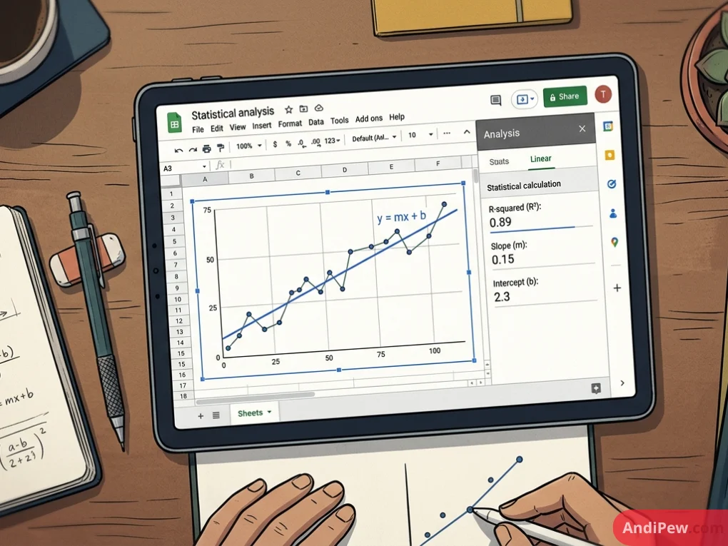
Step 1: Cleaning and Preparing Your Raw Dataset
Skilled data analysts recognize a fundamental rule: garbage in, garbage out. Raw exports from CRMs, ERPs, or web forms often contain irregular formatting, duplicate rows, missing entries, and extra whitespace.
Before running any google spreadsheets data analysis, follow these standard data preparation steps.
Removing Duplicates
Duplicate rows distort key metrics such as count, total revenue, and averages.
- Highlight your data range.
- Select Data from the top menu.
- Choose Data cleanup > Remove duplicates.
- Check the box if your data contains header rows, select the columns to evaluate, and click Remove duplicates.
Trimming Whitespace
Hidden leading or trailing spaces will cause lookup formulas (VLOOKUP, XLOOKUP) to fail silently.
- Select your dataset.
- Go to Data > Data cleanup > Trim whitespace.
- Alternatively, use the
=TRIM(A2)formula in a helper column to strip superfluous spaces.
Handling Blank Values and Data Types
Inconsistent data types cause formula errors:
- Check that numeric columns do not contain stored text numbers. Highlight numeric columns and format via Format > Number.
- Standardize date formatting across all rows via Format > Number > Date.
- Identify blank values using conditional formatting (Format > Conditional formatting > Rule: Cell is empty) to decide whether rows require imputation or exclusion.
Step 2: Essential Formulas for Google Sheet Data Analysis
A structured google sheet data analysis tutorial relies on foundational formulas. The functions below form the core of daily data wrangling and metric calculation.
Conditional Aggregations: SUMIFS and COUNTIFS
When calculating segmented metrics (such as revenue for a specific region during a given quarter), multi-criteria aggregations are essential.
=SUMIFS(sum_range, criteria_range1, criterion1, [criteria_range2, criterion2, ...])
Example: Calculate total sales in the “West” region for orders over $500:
=SUMIFS(D2:D100, B2:B100, "West", D2:D100, ">500")
Modern Lookups: XLOOKUP
While VLOOKUP is traditional, XLOOKUP provides greater durability because it does not break when columns move, supports reverse lookups, and includes native error handling.
=XLOOKUP(search_key, lookup_range, result_range, [missing_value], [match_mode])
Example: Look up an employee’s sales tier based on ID:
=XLOOKUP(F2, A2:A100, C2:C100, "Not Found")
Dynamic Filtering: The FILTER Function
Instead of manual copy-pasting, the FILTER function extracts records matching your conditions dynamically:
=FILTER(A2:D100, C2:C100 = "Enterprise")
When source records update, downstream analytical extracts refresh automatically.
Advanced Data Transformation: The QUERY Function
Unique to Google Sheets, the QUERY function allows you to execute SQL-like statements directly inside your spreadsheet.
=QUERY(A1:E100, "SELECT A, SUM(D) WHERE C = 'Retail' GROUP BY A ORDER BY SUM(D) DESC LABEL SUM(D) 'Total Sales'", 1)
This single formula aggregates, filters, groups, sorts, and re-labels your data dynamically.
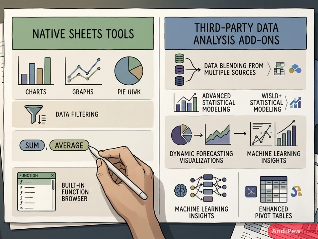
Step 3: Summarizing Insights with Charts and Pivot Tables
Tabular rows alone rarely tell a clear story. Generating dynamic summaries with google sheets charts and pivot tables converts massive sheets into readable executive reports.
How to Build a Pivot Table
- Highlight your cleaned data table including headers.
- Select Insert > Pivot table.
- Choose to insert it into a New sheet to preserve clean document architecture.
- In the side panel, place categorical dimensions into Rows (e.g., Product Line).
- Add numerical metrics into Values (e.g., Revenue) and configure calculation types (
SUM,AVERAGE, or% of row). - Add categorical breakdowns into Columns (e.g., Sales Channel) to create a multi-dimensional matrix.
Visualizing Your Results
Once your pivot tables are configured, generate clear visual representations:
- Trend Analysis: Insert a Line Chart to display continuous metrics over time.
- Categorical Comparison: Use Bar or Column Charts for discrete category comparisons.
- Composition: Use Stacked Bar Charts rather than multi-slice pie charts to display relative contributions clearly.
Step 4: Google Sheets Statistical Analysis and Regression Modeling
Beyond descriptive summaries, professional projects often require inferential testing. Google Sheets provides robust statistical functions out of the box.
Descriptive Summary Statistics
A proper exploratory workflow begins with calculating central tendency and distribution dispersion:
- Mean (Average):
=AVERAGE(range) - Median:
=MEDIAN(range)(crucial when data contains extreme outliers) - Standard Deviation:
=STDEV.S(range)for sample data;=STDEV.P(range)for population data - Variance:
=VAR.S(range) - Percentiles & Quartiles:
=PERCENTILE(range, 0.75)and=QUARTILE(range, 1)
Google Sheets Data Analysis Regression Modeling
Regression models assess relationships between independent variables (predictors) and dependent outcomes.
Method A: Visual Scatter Plot & Trendline
- Select two numeric columns (e.g., Ad Spend on the X-axis and Sales Revenue on the Y-axis).
- Go to Insert > Chart and select Scatter chart.
- Open the Customize panel and expand the Series dropdown.
- Check the Trendline box.
- Set Type to Linear (or Exponential/Polynomial based on theoretical assumptions).
- Under Label, choose Use Equation.
- Check Show R² to display the coefficient of determination.
Method B: Formulaic Regression using LINEST
For multivariable models or programmatic coefficient outputs, use the LINEST array formula:
=LINEST(known_data_y, [known_data_x], [calculate_b], [verbose])
Setting verbose to TRUE generates an array containing:
- Slope coefficients ($m$) and intercept ($b$)
- Standard errors for coefficients
- Coefficient of determination and standard error for the estimate
- F-statistic and degrees of freedom
- Regression sum of squares and residual sum of squares
This native calculation removes the need to switch to external statistical software for standard linear evaluations.
Step 5: AI-Powered Features and “Analyze Data” in Sheets
Google Workspace incorporates machine learning natively to speed up exploratory analysis.
Using Native “Analyze Data”
Located in the bottom right corner (or accessible via Tools > Explore / Analyze Data depending on your Workspace edition), the analyze data in sheets tool scans the current dataset automatically.
Automated Visual Summaries: The engine creates instant frequency histograms, correlation callouts, and category summaries.
Natural Language Queries: You can type plain English questions into the prompt box:
- “What was the total profit by rep in Q3?”
- “Show the distribution of delivery times as a histogram.”
- “Top 5 customers by sales volume.”
Sheets parses the query, returns the calculation, and lets you drag generated formulas or charts directly onto your canvas.
Modern Generative AI & Google Sheet Data Analysis AI
With Google Workspace extensions and Gemini-powered features, analysts can now use google sheet data analysis ai workflows to:
- Categorize open-ended customer survey responses into sentiment buckets.
- Extract standardized addresses or entity tags from unformatted text blocks.
- Auto-generate complex regex extraction strings and nested calculation scripts.
Step 6: Native Tools vs. Data Analysis Add-Ons
While native features satisfy many business use cases, complex statistical modeling and automated data pipelines may require third-party add-ons.
In desktop Microsoft Excel, analysts frequently rely on the Analysis ToolPak. In Google Sheets, you can configure an equivalent setup using a dedicated google sheets data analysis add on or google sheets data analysis toolpak alternative.
Popular Google Sheets Add-Ons
- XLMiner Analysis ToolPak: Recreates legacy Excel statistical routines inside Sheets, including two-sample t-tests, z-tests, ANOVA (one-way and two-way), correlation matrices, and exponential smoothing.
- Supermetrics: Automates live data pipelines from platforms like Facebook Ads, Google Ads, LinkedIn, and Shopify directly into your spreadsheet.
- Numerous.ai / SheetAI: Brings large language model prompts directly into formulas for content analysis, classification, and text cleanup.
Comparison Table: Native Features vs. Add-Ons
| Analytical Capability | Native Google Sheets | XLMiner / Statistical Add-ons | API / BI Tools (e.g., Looker Studio) |
Basic Aggregations (SUM, COUNT) |
Built-in & Instant | Built-in | Built-in |
Dynamic Filtering (QUERY, FILTER) |
Native & Fast | Native | Native SQL-based |
| Pivot Tables & Basic Visuals | Native drag-and-drop | Native | Advanced, highly customizable |
| Two-Way ANOVA & F-Tests | Manual formula setup | Automated 1-click execution | Typically requires data warehouse preprocessing |
| Multivariate Regression | Handled via LINEST |
Dedicated dialog box output | Handled in warehouse / Python |
| Scalability Limit | Up to 10M cells | Bound to sheet limitations | Millions of rows via cloud pipelines |
Step 7: A Real-World Google Sheets Data Analysis Project
To consolidate these concepts, let’s walk through an end-to-end google sheets data analysis practice scenario.
Scenario: E-Commerce Retailer Optimization
Imagine you are handed a raw transactional export containing 15,000 order records with columns:
Execution Steps
- Cleanse: Strip extra spaces with
TRIM, ensure dates useYYYY-MM-DDformatting, and deduplicate byOrder_ID. - Feature Engineering: Add a
Net_Salescolumn using: =(D2 * E2) * (1 – F2) - Cohort Aggregation: Build a Pivot Table setting
Channelas Rows,Customer_Segmentas Columns, andNet_Salesas Values summarized bySUM. - Hypothesis Evaluation: Run a regression analysis comparing
DiscountagainstQuantityto determine if discounting drives volume increases or simply erodes gross margin. - Dashboard Presentation: Place key metrics (Total Revenue, Average Order Value, Conversion Rate) at the top of the sheet using clean scorecard blocks, followed by dynamic charts.
Best Practices for Professional Data Workflows
Maintaining accurate spreadsheets requires disciplined documentation and clean workbook architecture:
- Separate Raw Data from Calculations: Always keep your raw imported data on a protected tab labeled
RAW_DATA. Build staging transformations on a second tab, and present final dashboards on a dedicatedDASHBOARDsheet. - Document Formula Logic: Use the
N()function or in-cell comments (Shift + F2) to document complex nested statements so teammates understand your calculations. - Use Named Ranges: Replace hard-to-read references like
Sheet1!$D$2:$D$450with descriptive names likeTransaction_Amounts(Data > Named ranges). - Protect Core Ranges: Lock formula columns and summary tabs via Data > Protect sheets and ranges to prevent accidental overwrites.
- Exporting Clean Reports: When sharing findings with leadership, export polished sheets as formatted documents (File > Download > PDF Document) with gridlines hidden for a clean presentation.

Frequently Asked Questions (FAQ)
Is Google Sheets powerful enough for professional data analysis?
Yes. For datasets under 10 million cells, Google Sheets handles cleaning, aggregations, cohort analysis, pivot modeling, and regression effectively. For massive enterprise data warehouses with hundreds of millions of rows, dedicated cloud databases or tools like BigQuery connected via Connected Sheets are recommended.
How do I enable the Analysis ToolPak in Google Sheets?
Google Sheets does not include Excel’s legacy ToolPak by default. You can access identical functionality by opening Extensions > Add-ons > Get add-ons and installing the free XLMiner Analysis ToolPak.
What is the most effective way to practice data analysis in Google Sheets?
The best approach is working with real public datasets. Download free transactional tables from platforms like Kaggle or data.gov, import them into Sheets, and practice cleaning, aggregating with pivot tables, and testing relationships with LINEST.
How can I share reports without exposing my underlying formulas?
You can duplicate your dashboard sheet, highlight all cells, press Ctrl + C (or Cmd + C on Mac), and use Edit > Paste special > Values only. Alternatively, export the finished analysis to a PDF or build an interactive report in Looker Studio using your sheet as a data source.
Conclusion
Google Sheets provides an accessible, collaborative, and surprisingly deep environment for modern analytics. By mastering foundational cleanup workflows, standard dynamic formulas like SUMIFS and QUERY, structured pivot tables, and regression modeling, you can uncover actionable patterns without steep software learning curves.
Set up a sandbox spreadsheet, import a sample dataset, and build out the exercises detailed in this guide. Consistent practice with real data is the fastest way to turn raw spreadsheet rows into reliable business insights.